ELLEN BENNETT
I met Ellen two years ago, she was the moderator for a panel discussion I participated in at Herman Miller, L.A. on the topic of Color and Food. From the moment we met, I adored her. Her bright colorful outfit was a declaration worthy of her warmth and exuberance. As a line cook at Bäco Mercat and Providence in Los Angeles, Ellen had an epiphany that the aprons donned in the kitchen were boring and drab and essentially needed to be reinvented. While working both line cook jobs, she delved heart first into starting and growing her apron business. Learning was essential, spending time at farmer's markets, bravely walking into kitchens and introducing herself to chefs from all over. Ellen had questions and is brilliant at engaging in dialogue. Once she did her homework, she executed. It is no wonder that she has grown beyond aprons. Hedley Bennett is now a beloved culinary brand.
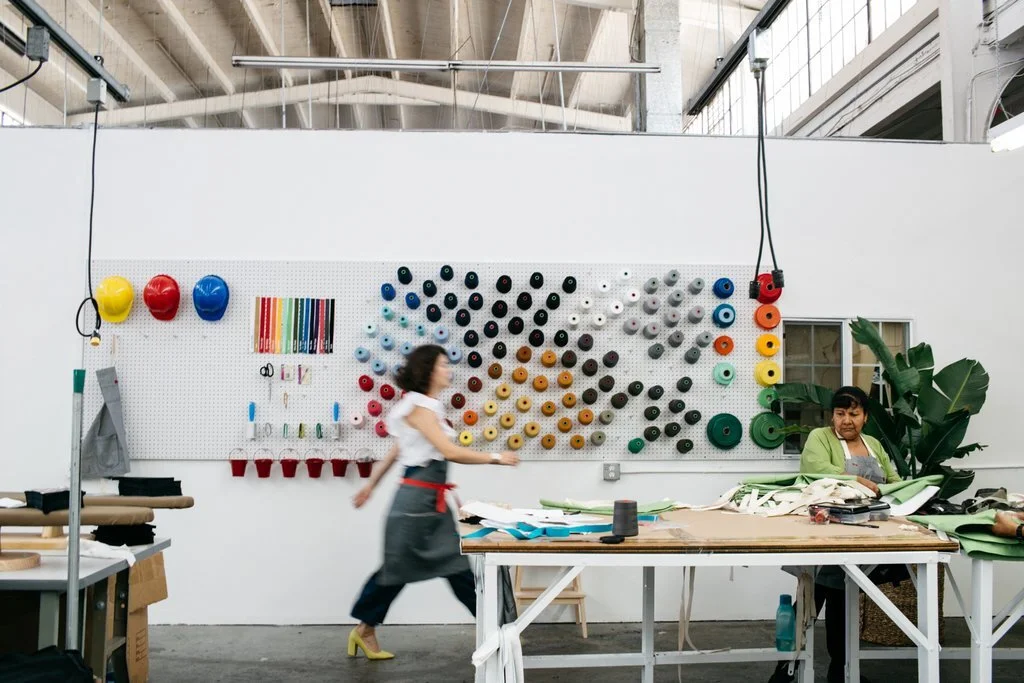
photo courtesy of Hedley & Bennett
LAURA GUIDO-CLARK: CAN YOU SHARE A SIGNIFICANT COLOR MEMORY?
ELLEN BENNETT: When I went to Mexico, I would visit my Mexican grandmother's house. The house was bright turquoise, an almost aquamarine blue. It was bright like nothing I had ever experienced before. Her house was loud and cheerful and said HELLO world, here I am. It was the polar opposite of the American culture that I lived in. Later, I went on to paint my kitchen in Mexico City the same color turquoise.
LG-C: HOW DO YOU USE COLOR FOR SELF EXPRESSION? HOW HAS IT SHAPED YOUR WORK?
EB: Color plays a role in my whole life, not just my work. I honestly think that people don’t know how to use color. Color can sometimes shock people, making them feel things that they don’t expect. As a person, I like to surprise people, and I like to push them out of their comfort zone.
When I began, I did a few aprons. I had a partner who was certain we needed to make all aprons neutral. But I really wanted to do a red apron. Initially, I stuck to just the neutrals but when we were no longer working together, the first thing I did was make the red apron. I called it Red Rover. Everybody loved it. They might not have all bought it, but Red Rover sure helped me sell the neutral aprons!

photo courtesy of Hedley & Bennett
LG-C: YOUR WEDDING WAS FEATURED IN HARPER’S BAZAAR. CAN YOU SHARE HOW COLOR PLAYED A ROLE IN YOUR WEDDING, AND HOW THAT CAME ABOUT?
EB: The role of color in our wedding was a joint collaboration with my husband and me. It began when we went to Paul Smith to get his wedding suit. There were a pair of fuchsia shoes, and they looked so good! We thought it was crazy, but they were elegant, just the perfect pop of color for us color maniacs. From there the shoes set the tone! We were married on the Day of the Dead, whose celebratory flowers are marigolds and cockscombs, which are a hot pink color. The hot pink flowers became my bouquet. It was so perfect because one pink (my bouquet) came from nature and the other, his shoes.
Yellow is my absolute favorite color, and I wanted a yellow dress. Christian Siriano made my dress. Even Christian didn’t get it as yellow as he wanted too, so, last minute he added yellow tulle to drive it where he wanted it. It made me happy.
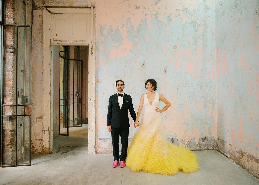
photo credit: Maria Limon
LG-C: WHICH ONE OF YOUR SENSES, ASIDE FORM SIGHT, DO YOU MOST ASSOCIATE WITH COLOR?
EB: Taste. For me, when you see things, you can taste them. I can remember the way things look, and I think of it as a color when I taste it. The food at our wedding was insanely colorful. There was an interesting turn of events. We started out thinking we would use white and brown tables, but by the end of the wedding planning, we had decided on black tables. The black tables made the ROYGBIV colors stand out, all the fruits and vegetables. Pomegranates and squash against the black made it elegant and sexier. It outlined every vegetable and fruit on the table. It was like they were framed.

photo credit: Maria Limon
LG-C: CAN YOU SHARE SOMETHING YOU SAW LATELY THAT WAS COLOR CAPTIVATING?
EB: The Luis Barragan house in Mexico is my favorite. It really has had a big impact on me. It was spectacular. The pink wall alone inspired me to figure out how to do it at my house.
LG-C: CAN YOU DESCRIBE THE PINK?
EB: It was very timeless, not a trendy pink. It was as if it had been through many lives. I like to think of it like a seasoned pink, one that wasn’t created today but had been around for a long time. It has remained in my memory. When I saw that pink, it gave me permission to use pink as extravagantly as I could. Barragan designed a stunning home in the middle of this neighborhood. It was such an audacious statement. He knew it and owned it. I don’t think when he first did it that it was well-received. Now it is, but some of the best things take people time to realize the magic of it. Sometimes you have to bring crazy to the world. When something is different it is sometimes rejected, so you need to be brave!
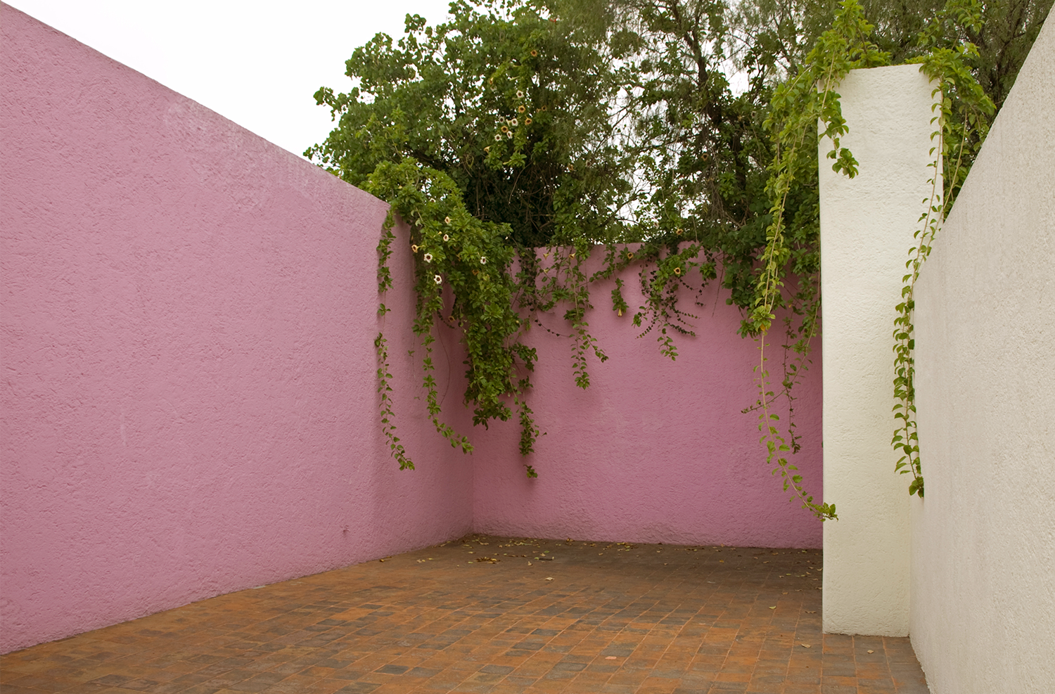
Luis Barragan House
LG-C: TELL ME ABOUT YOUR LATEST PROJECT.
EB: I am writing a book. It is a big project having to put it all out there. I find it nerve-wracking, laying yourself out there to the world. I feel vulnerable. It is like using color. It is my personal journey, a journey that is on its way. I am very excited about Wieden Kennedy doing the book. It is very design-forward which is sometimes unexpected for a business book. I am treating it as an art project. Full pages of color and of shapes. It is about my life, starting something from nothing. I am excited to share the evolution of the business and of the pivoting required to maintain and evolve a business. We were an apron company and now we are a culinary brand dedicated to professional-grade quality, excellent ingredients and great design. When all three are there, it will stand the test of time.
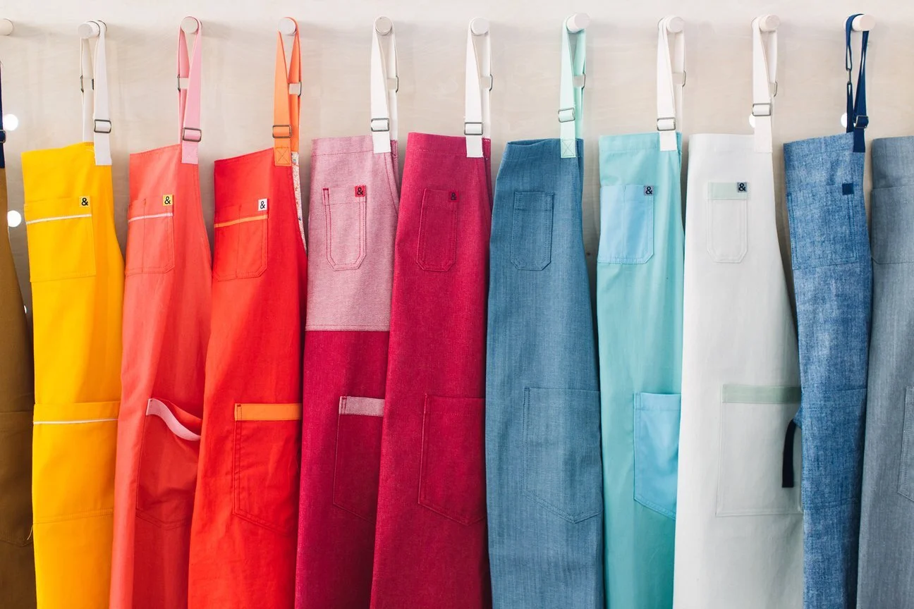
photo courtesy of Hedley & Bennett
to see more about all things Ellen Bennett: