
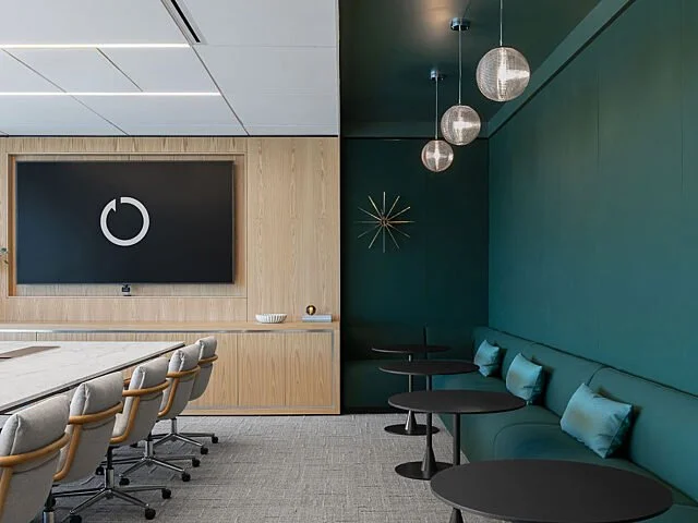
Using LOVE GOOD COLOR to define the showroom as an experience rather than just a space.
XXX
THE TEAM: Pivot Interiors (Cat Peterson, Workplace Strategy Director; Adam Wier, Senior Lead Designer; Darcy Ritter, R&D Producer)
THE PROJECT: San Jose Flagship Design Center
THE APPROACH:
When the design team at Pivot Interiors set out to create their new San Jose Design Center, they weren’t simply looking for a color palette—they were looking for a feeling. Instead of beginning with swatches, trends, or individual color preferences, their process started with a simpler, human-centered question: How should people feel when they walk through the space?
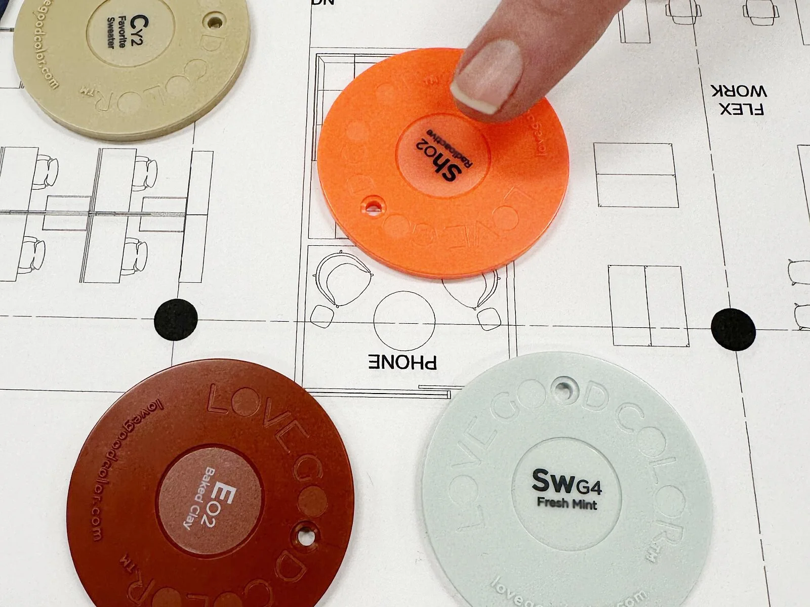
“From the onset, we knew we wanted Laura Guido-Clark and the Love Good Color® (LGC) system to be part of the design process for our new flagship location,” says Cat Peterson. “We started with the experience we wanted to create, defining a base palette rooted in our brand identity and, more importantly, in how we wanted people to feel in the space: invited, inspired, connected, and confident.”
That shift became foundational to the design journey. Instead of debating colors, Pivot’s stakeholders aligned around emotional outcomes. The team developed a shared language that guided decisions throughout the project, keeping everyone focused on the experience they wanted to cultivate.
“It allowed us to make decisions with greater intention,” Cat explains, “grounding each choice in the emotive response we wanted to create rather than getting caught up in individual preferences along the way.”
XXX
XXX
XXX
A Different Way to Think About Color
For Senior Lead Designer Adam Wier, one of the most powerful aspects of the Love Good Color® (LGC) process was the ability to simplify conversations around design.
“When we work with LGC, we’re working in the realm of emotions,” he says. “By orienting to how the space should feel rather than jumping into color selection, we circumvent the challenges that come with color language and lead with emotional impact.”
By focusing on emotive response, the process breaks down traditional barriers between designers, clients, and stakeholders.
“When we work in the realm of emotive response, we remove the industry jargon and color trends,” Adam says. “We drop the barrier between design professional and client, and distill the conversation down to its essential nature, where everyone can be, and in fact is, an expert.”
The approach also encourages a broader exploration of color. Rather than limiting a project to a small collection of safe choices, emotional storytelling creates opportunities for richer and more dynamic palettes.
“In developing a rich and diverse emotional landscape for a project, the resulting emotion-based framework asks for a more varied color response,” says Adam. “The emotional ‘ask’ is essentially a permission structure to use more color.”
XXX
Beyond the Palette
As the project evolved, the influence of Love Good Color® extended far beyond finishes and furnishings.
“The LGC framework became a touchstone throughout the process,” Cat says. “It influenced everything from color and materials to the character and atmosphere of each space.”
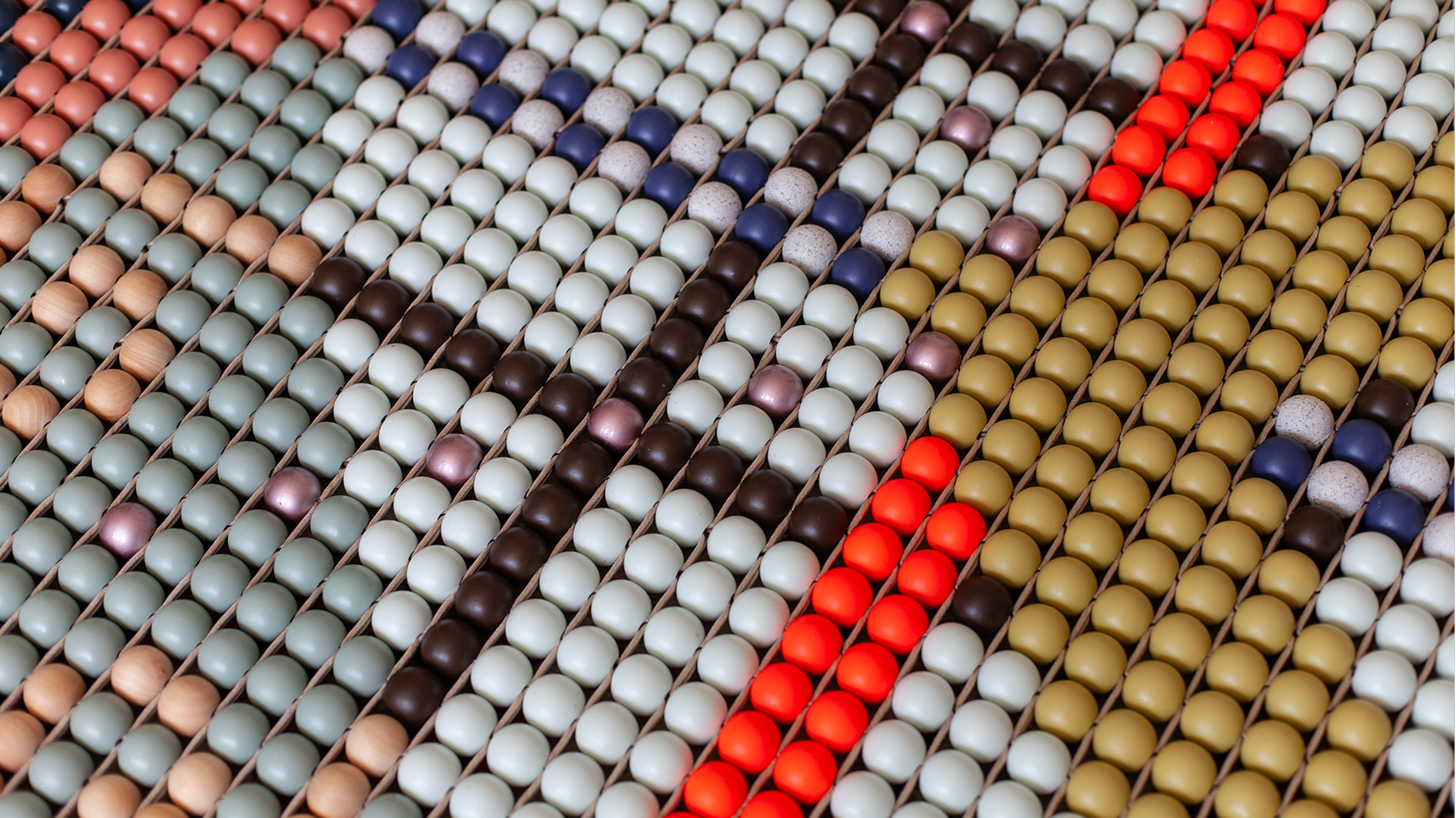
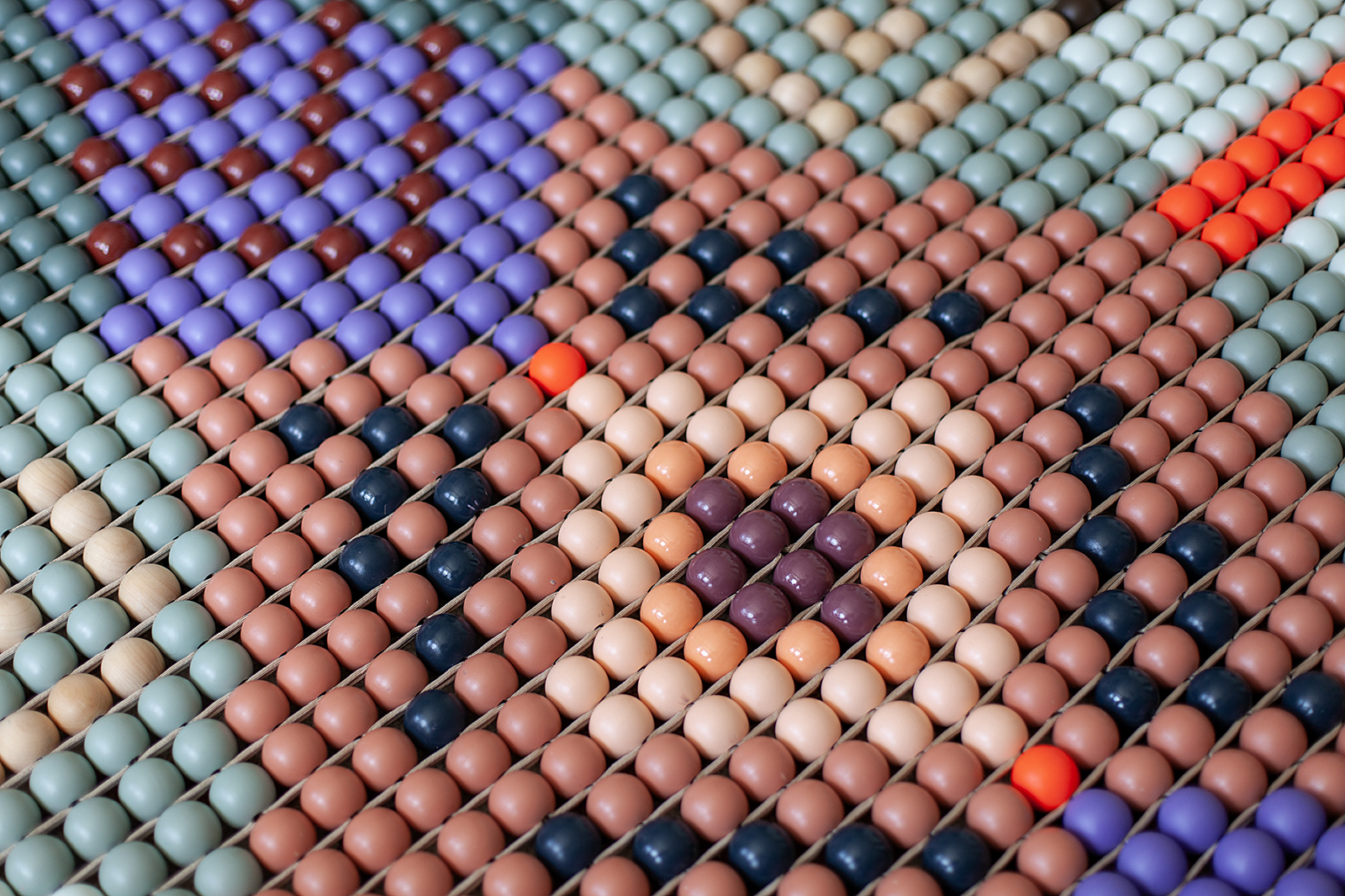
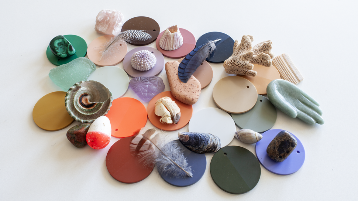
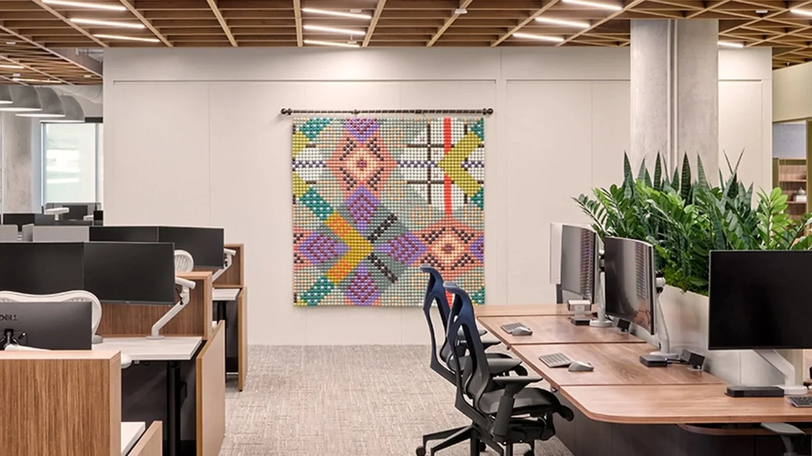
One of the most visible expressions of that influence is a large-scale beaded wall hanging in the design center, created by designer Adam Wier. Inspired by the 21-color palette developed during the process, the installation translates the emotive language of the showroom into a physical work of art. The piece serves as both a reflection of the space and a reminder that design is ultimately about creating meaningful human experiences.
Unexpected Moments
That willingness to explore led to a palette that might initially seem unexpected.
“We used many different colors and at first glance, once we selected all of them, we thought to ourselves, How is this actually going to work?” recalls Darcy Ritter.
XXX
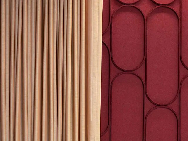
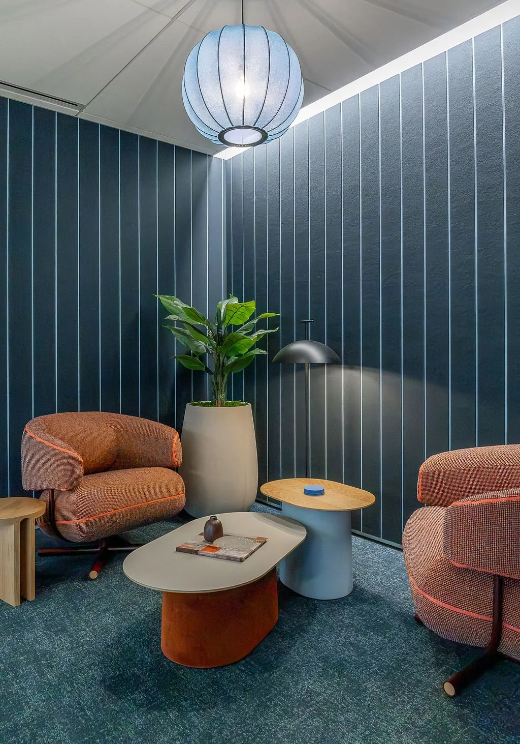
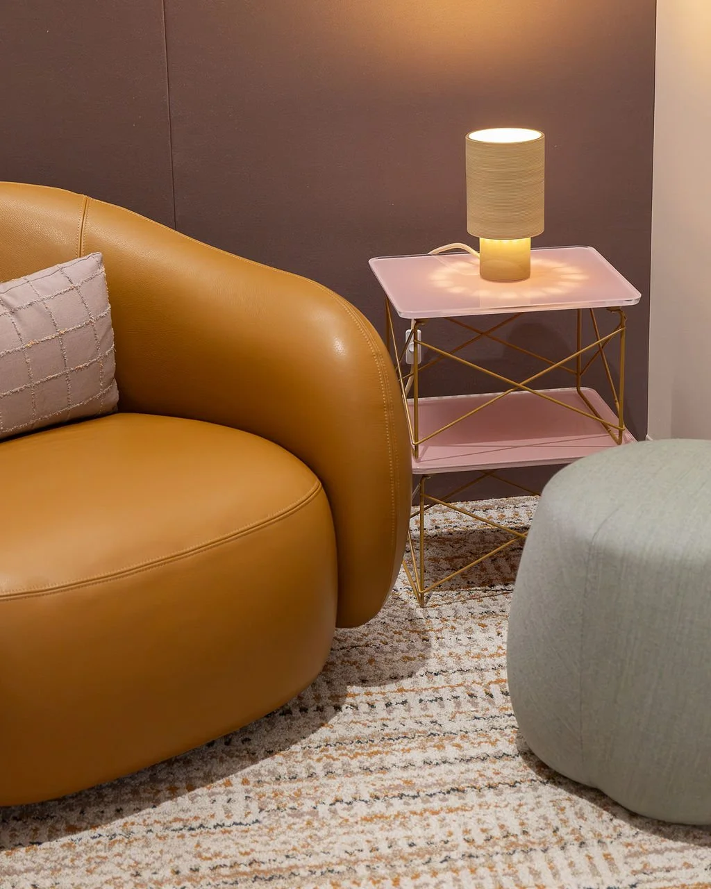
The resulting palette included terracotta, dusty pink, deep green tones, smoky blues, and a bold bright pink accent used selectively throughout the showroom. “But because of the LGC system, it actually came together so beautifully,” she notes.
Starting with a core palette and thoughtfully expanding it allowed the Pivot team to create distinct experiences throughout the showroom while maintaining a cohesive visual story.
“As we thought about how we wanted people to feel in our space and how to best represent our company, the color palette came together really easily using the LGC system,” Darcy says.
The result is a series of environments that each carry their own emotional character: some spaces feel calm and restorative, while others feel energetic, social, and activating. Together, they create a journey through the showroom that feels both intentional and intuitive.
“We wanted people to feel a certain way when they walked into different rooms,” says Darcy. “Using color to help create that mood worked.”
More Than a Decorative Element
“Seeing the process resonate with Adam, who created an artwork inspired by our palette that is now on display, was a particularly meaningful part of the journey for me,” says Cat. “It’s a wonderful example of how color inspiration can extend beyond the design itself and become part of the larger connective story we’re telling.”
More than a decorative element, the piece was envisioned as an exploration of visual perception. Inspired by moiré patterns generated through digital CET and AutoCAD studies, the work emerged from a process of exploring geometry, repetition, and optics. After generating numerous compositions, Adam selected a pattern that felt both structured and infinite, creating dynamic movement through the interaction of light, shadow, and color.
XXX
XXX
XXX
The artwork is rooted in the same palette that defines the showroom. Adam completed multiple digital studies to balance pattern and color distribution before bringing the physical piece to life. The result is an installation that echoes hues found throughout the space, weaving visual connections across different settings and experiences.
“Design is often about finding meaning in individual elements and bringing them together into something larger,” Adam explains.
That philosophy informed both the concept and construction of the work, encouraging visitors to slow down, stay curious, and discover new details as the piece shifts with changing light throughout the day.
3,249 Beads
The tactile quality of the artwork is central to the experience. Sensory, dimensional, and highly crafted, the installation invites viewers to engage with it beyond its visual presence. Its physical scale is substantial as well: the finished work weighs approximately 100 pounds and is composed of 3,249 individual beads.
Each bead is woven into and supported by the surrounding structure, creating strength through connection. In many ways, that mirrors the story of the showroom itself, where countless ideas, contributions, and creative perspectives came together to form a cohesive environment.
For Adam, the work also brought a personal dimension to the space. Having contributed to the design center’s creation, he saw the piece as an opportunity to leave behind something tactile, human, and expressive. The installation serves as a visual echo of the showroom—reflecting its colors, energy, and creative spirit while offering visitors a moment to exhale and engage their curiosity. At its core, the piece is a reminder that great design is built from many individual parts coming together to create something meaningful.
“Collaboration was at the heart of the project process. In a space where materials, textures, and color are essential to the final experience, the thoughtful approach to color selection provided a way to connect with the range of emotions we were pursuing,” said Antonio Caliz, Design Principal, AP+I.
“Laura’s process is highly creative and provides designers and clients a safe environment to explore and ultimate discover moments of delight through the use of color.”
XXX
Color You Can Feel
For the Pivot team, the true measure of success has been the response from visitors.
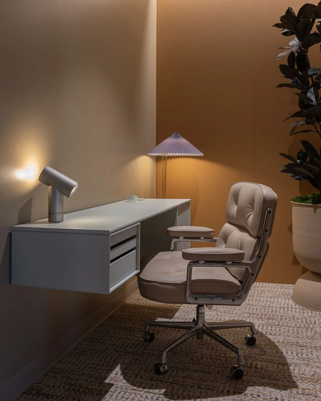
“We’ve received so much great feedback on our color selections,” says Darcy. “People love the warm feel of the space. The bold colors mixed with lots of warm wood tones really stand out.”
More importantly, visitors are experiencing the showroom exactly as intended.
“Some spaces feel really calming while others are energizing, and people have picked up on that,” she says. “It’s always so fun to hear how they feel when they enter certain spaces, especially when they describe the feeling exactly as we had planned and intended it to feel. I think that means it is a success.”
Ultimately, that is what the Love Good Color® process helped achieve: a showroom designed not simply around aesthetics, but around human experience.
“At its core,” Cat reflects, “this process reminded us that the most meaningful design outcomes come from curiosity, collaboration, and a willingness to look at familiar ideas in new ways.”
The result is a space where color does far more than define visual identity—it shapes how people move through the environment, connect with it, and remember it long after they leave.