ELIZABETH VEREKER

Elizabeth in Zurich with a backdrop of Corbusier
I am thrilled to have had the opportunity to interview Elizabeth Vereker, Brand Director of O+A. I love her work, it is visceral, joyful, and powerful. Last year, I had the wonderful opportunity to collaborate with her and Verda Alexander (stay tuned for her interview) on Raphael House, a Project Color Corp project that will transpire this year in San Francisco, CA. She is a color natural, an incredibly intuitive designer, and a thought-provoking conversationalist. She is now my neighbor in Berkeley, CA and I can’t wait to spend more time with her in person.
Laura Guido-Clark: WHEN I SAY THE WORD COLOR, WHAT DO YOU THINK OF?
Elizabeth Vereker: Life, experience, joy. I think in color and vibrancy. I associate them with cities, travel, and memories. All of life is color.

LG-C: CAN YOU SHARE A SIGNIFICANT COLOR MEMORY OR YOUR FIRST COLOR MEMORY?
EV: I remember the first time I ever got the 64-box of Crayola, it was amazing and the whole world was at my fingertips. I would stick my face in it and smell it. When I was in preschool, Reading Rainbow (an educational show in the ’80s) had a visit to the Crayola factory, my mom and I watched it a dozen times. The pure color, how it was molded and wrapped. Ever since that time I have been interested in how things are made and the purity of hue. Every year at back-to-school time it was one of my favorite things. I couldn’t wait to get my new box of 64 colors with the sharpener in the back, opening up the lid, and taking in that smell of wax and creativity. Now I relate that to a new Pantone chip book when none of the chips have been torn out. My mom was a first-grade teacher so there were a lot of supplies around. The smell of Crayola crayons is still one of my favorite smells in the world.
LG-C: HOW DO YOU USE COLOR FOR SELF-EXPRESSION?
EV: It’s interesting, when I think of self-expression I think of fashion and crazy hair color. I am not any of that, my closet is 40% black, 40% off-white, and 20% other. I don’t use color a lot for personal self-expression or brand, I leave that to colorful conversations. I use color for self-expression throughout my space. I collect a lot of things and they make color stories. I have loads of typographic prints I picked up on travels. They have punchy blues, neon oranges, and deep mustard yellows. I surround myself with color to create a mood or energy. I think that, over time, the colors you surround yourself with impact how you show up in the world. When I moved into my new apartment, I realized how much color can change a mood in a room. My office was watermelon pink and the old window shade was manila, when the sun was shining it felt like I was in a James Turrell, it was so much! The original bathroom was three different shades of yellow and the bedroom two different shades of beige. Just putting up a bright white or cool gray changes our emotions, it affects how we process information and in turn, express our reactions. I gravitate towards black and off-white geometric patterns interspersed with bright colors. I love complex colors that mainstream deems ugly. My coffee cup looks like “baby poop brown” and I love it so much. It’s a fantastic neutral. I found it at a shop in Berkeley and my friend couldn’t believe I wanted it, but I told her that I think it is so beautiful. I love cast-off colors that are under-appreciated. Balance in building palettes is similar to building compositions in music and food, the layering and the push and pull are important. When you have 3 or 4 vibrant colors, throwing in an off or unexpected color makes the whole palette shine brighter. Since moving here I notice a lot of this color (baby poop brown), it is everywhere, especially in the layering of colors or nature. It is in aging roof tiles and in tree bark. The layering of colors in nature is incredible.
LG-C: WHICH ONE OF YOUR SENSES, ASIDE FROM SIGHT, DO YOU MOST ASSOCIATE WITH COLOR
EV: I was trying to think about this because I don’t know how to separate them out. All of my senses except touch have a strong link to color. Smell to me has the strongest association because it is what has the greatest ties to memory which I tie back to color. So for me, mostly smell. When I smell something I don’t associate a specific color but a memory and an entire composition of all colors. If I smell cinnamon and apples, I don’t think of brown, but of my grandma’s kitchen, the wallpaper, the rug, the counters, and her apron.
LG-C: HOW & WHERE DOES COLOR PLAY A ROLE IN YOUR WORK?

Book Design Process
EV: Color plays a HUGE role in my work. Color is integral to story-telling and to creating place, meaning, and hierarchy. Even when there isn’t a variation of color, there is color in density. Studying typography in grad school really changed how I think about color. Color in type doesn’t mean the words are blue or yellow, it is how dense are the words or how close together, and what is the strength and intensity of the block on the page. That relates to spaces a lot— how much white space is in a room, how is the light affecting it? Color is one of the strongest tools we have in storytelling. It can convey a concept before design is there to talk about impact, meaning, hype, intensity, and areas of focus. It comes into every single part of the process. One of the first places I start in a project is with color. Concept and color tie hand in hand. Pick any one of our clients and color rooted with it— when I think of Adidas I think of future-craft in sports, when I think of McDonald’s I think of Americana, road trips, and food.
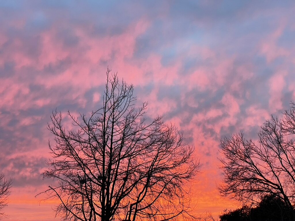
Berkeley sunset
LG-C: WHAT IS SOMETHING YOU SAW LATELY THAT WAS COLOR CAPTIVATING OR REVELATORY?
EV: I have been really inspired by the brilliance of the sunsets in Berkeley. In the absence of travel and art and visual noise this past year, I have become much more attuned with the subtle colors of nature; how they look different from one part of a day than another, the opening and closing of plants, and changes in textures. How canopies cast patterns on walkways, how the sun hits the side of a building at dusk. One ritual I have almost every night is to go on a nature walk in the Berkeley Hills to take the time to enjoy the sunsets. Seeing how the colors change, how they shimmer on the water and the skyline of San Francisco … every evening is a different palette. The brilliance of the oranges and reds is so lovely. The sunsets are particularly magical when the fog is rolling in. That has been huge for me in terms of grounding as well as invigorating me.
I love the colors in the architecture here, as head toward the Rose Garden and Grizzly Peak you pass homes by Julia Morgan, Bernard Maybeck, and other greats. Then you see a Swiss-German-style home next to a dramatic Tudor next to a Mediterranean mansion and then a hodgepodge of renovated homes where the vernacular is so different. There is one home near my Post Office where the framing is striped pink, mustard, and green. All those hits of color against wood-shake facades or white walls make me think about using color purposefully and how to balance. Once you train your eye and open your mind, there is inspiration all around.
LG-C: IS THERE ANYONE WHO HAS INFLUENCED YOU WITH REGARD TO COLOR?
EV: I look to art and fashion. Designers and their runway shows, Gucci, Marni, Dries Van Noten, Miu Miu. The way they use color, pattern, transparency, and layering go far beyond anything we are doing.
The freedom and luxury of expression in fine art are inspiring because nothing needs to be watered down and mass-produced. I love modern art. Anytime I feel stuck I look at artists or try to book travel to a big art or design show. During the pandemic, I’ve been going to virtual museums, as well as more closely following local artists. One of my favorites is Clare Rojas, who is part of the Mission School out of San Francisco. Her geometric work has color palettes that feel both timeless and timely. I love her use of color. In general, when we aren’t in these times and I can travel and indulge, I’ll go to Dutch Design Week and the Venice Biennale and soak up enough inspiration for a decade. They are so fascinating.

Audiovisual installation by Studio Nick Verstand at Dutch Design Week that reinterprets emotions as pulsing light compositions.

Color/Material studies from Dutch Design Week
LG-C: WHAT COLOR CHALLENGES DO YOU FACE?
EV: Not getting in a rut. I think that as designers we have our favorite colors that are tried and true. I am guilty of that as well. I have four or five color combos that I love. Moving beyond that is hard. I also try to move past my own bias of colors that I don’t like, which for me it is purple.
Talking with clients, particularly young clients, and convincing them to let go of their brand color and not put it everywhere. I speak about the purpose of color, both internal and external, and about purpose and longevity. I try to demonstrate how a small hit of color is often more impactful than a lot of it. How to make color meaningful and drive it to the right design solution.

Safety posters for COVID 19
LG-C: DO YOU HAVE A PHILOSOPHY YOU WORK BY?
EV: Yes, always do the absolute best that you can, always ask the why, and always ask where is the joy? For me personally, the reason I got into design in the first place was the psychological aspect of spaces and their ability to make people feel a range of things, from comfort and belonging to amazed and inspired. Space is a means to transform psychology. I always think about it in our work. Where is the joy, where is the whimsy? Where are the places for respite and reflection? How will it make people feel to experience a print, a book, a website, a space? The work we do is meaningful and important. The spaces we create are the backdrop to people’s greatest successes, inventions, interactions, and connections. We are building the backdrop to memories.

Yelp environmental graphic referencing the tulip fields of the Netherlands. Photo by Jasper Sanidad